Wednesday, 9 December 2009
Audience Feedback on merchandise
Thursday, 3 December 2009
Evaluation Planning
20% of marks are for a thorough and critical evaluation.
Each candidate will evaluate and reflect upon creative process and their experience of it. Candidates will evaluate their work electronically. Each candidate will be asked several questions.
Examples could be:
Pod cast (radio)
DVD extras
Questions
1. In what way does your media product use, developed, or challenged forms and conventions of real media? (I.e. performance, narrative, editing style)
2. How effective is the combination of your main product (the video) and additional texts? (DVD cover and Advert)
3. What have you learned from your audience feedback?
4. How did you use media technologies in the construction and research, planning and evaluating? (Did you use cameras? Dictaphones, microphones, Lights ECT)
Ideas for DVD Extras
Videos
Interviews
Before and after effects shot
Directors Comment
Voice overs
“How to” Video
Feedback session with audience
Deadlines
Evaluation- Friday 11th December 4pm
Save Evaluation into a suitably named folder in the “Evaluations finals Folder
Requirements
Must Be done in groups
Cameras and other equipment are available to book on Monday 30th November
Ideas
Interview/commentary-Talk about the video whilst answering the questions also showing parts of the video whilst talking about it.
Which products we are going to use
Interview
Voice overs
Audience feedback
How we are going to answer the questions
Question 1
· Director Interview/commentary
· Show certain clips and talk about them with a voice over.
Question 2
Band interview/commentary
Question 3
Producer interview/commentary
Clips of audience (before and after)
Show rough cut then final cut
Question 4
Talking over the clips
interviews
Talk about
Influences by ….. Showed conventions……but we wanted to do this…..
Influences
· Panic at the disco- idea to use their theatrical narrative but due to complications and low budget we scrapped the idea
· The killers- Mr Brightside- Their narrative of the love story helped influence how our story ended
· Paramore- Their stage presence and energy influenced us to be as energetic as possible from beginning to end of the performance
Conventions
The majority of rock narratives are loved based
The typical jump cuts from the narrative to the performance
The rock videos typically don’t have a happy ending
Thursday, 26 November 2009
Rough cut and Feedback
We asked 20 students to watch out music video and give us some feedback on how we can improve it. At the very start of the video there is a jump of when the girl in the middle of the two boys was meant to disappear. This was suggested to be more of a smooth dissolve rather than a jump. When we are editing our video we will be sure to make this change as we all agree that the editing could be better, and as this is at the very start of the music video we need to ensure that its an eye catching opening as this sets the first impressions for the viewers. 16/20 people said that the ‘cube’ effect does not fit with the video, therefore as this idea has been stated by 16/20 people we will be sure to make this change. 20/20 people said that the clip where the girl is collecting the petals from the heart shape and putting them back onto the flower, it was said to be a very original idea. As this rough cut is not completely finished everyone that viewed this clip stated that we must fill in the black screens with footage, be it band performance of the narrative element. The band shots were said to be very original and filmed to a high standard, everyone said that they would like to see more band shots as these are to such a high quality.Overall we still have a lot more work to do within our music video and we will ensure that we meet the deadline. We have lots of footage to fit into the song and we will edit this to a high standard.
Tuesday, 24 November 2009
DVD merchandise
DVD advert:
 For the poster I followed some typical conventions from the style model advert such as the large dominant band image, the check board line across, lack of colour and the black text background at the bottom. With the image I airbrushed it removing an impurities that the band members weren’t pleased with such as fly away hairs, spots and patchy skin tones this was all smoothed out to give flawless appearances. I also removed and blended out the thumb up from one of the band members as it gives a more professional look as it didn’t seem to fit the image of the band. I edited the image to black and white then added a sepia tone over the top to match the tone of the DVD cover to keep the theme constant. The bands name is across the top with the name of the album underneath using the same fonts also used for the other merchandise. We decided to go for a sort of action shot of the band ‘laughing’ with the wind blowing, this suggests the every day approach of the band, it also shows there strong connection that they have between one another. I copied the pattern of the checked black and white using photoshop elements and put it across the poster which I took from the style model I think it looks really good isolating the information from the picture. I haven’t overloaded the poster with text but I have but the key information on, including songs which the DVD is featuring and a website linked to where you can buy the dvd online. On most dvd adverts they only have an image of the front of the dvd but we felt it was important that the audience was seeing everything that they were going to be buying therefore I included the front, back and spine. This is favour also filled up more black space as well and worked really well alongside the text.
Front, back and spine of DVD :
 This is our finished DVD cover. All the images on this cover are original. We drew the skull in order to remain original and the image in the skulls eye is taken from our video footage from our music video. We made this image in the eye more ‘ghost like’ by editing the opacity levels to 41 instead of 100 using Photoshop. This made the image look more professional as throughout our music video we have people disappearing; this makes a strong link with our music video however the link is very subtle. Another reason for making the band members look more ‘ghost like’ is to make sure that the main focus within the DVD cover is the skull. I feel we achieved this as after asking 10 people in our media class, they all agreed that the main focus within the cover is the skull. The band members are a nice touch in the eye as this makes the cover look exciting and interesting. Having the colour scheme sepia with white text throughout this DVD cover was important to us as it looks professional and we did not want it to look too busy and cluttered. That is also the reason why we kept two fonts throughout the merchandise. The script font was used for the title of the band and the basic font was used for the album name, track listings and copyright information etc. I feel the normal font and the script font work well together as they compliment each other well together. We chose white as the font colour because it stands out well on the sepia background. We tried it firstly with black font but some of the font was lost and difficult to see in some places of the DVD cover, for example the album name was difficult to read as it is very close to the black eye of the skull. At the bottom of the DVD cover I decided to include a ‘featuring: Cute without the E’ this shows the reader that if they knew the song but was not aware of the band who sang it, the song name catches their eye making them want to pick the DVD cover up to look at the song listings on the back.We took photographs of our own DVD’s at home so we could make the ‘DVD’ logo, ‘WB’ logo and the ‘parental advisory’ logo original. We then edited these photographs on Photoshop and then pasted them onto our cover. This stops any kind of copyright within the logos. We also did this with the barcode on the back just to ensure that all our images were original. The stars on the back of the DVD cover next to the quote from MTV Base were also hand drawn using paint then pasted onto Photoshop.We decided to have 20 listings as out style model that we used had 21; we wanted to make the listings more even as we decided to have them in two short columns of 10. By having these in neat columns makes the DVD cover look tidy and professional. I decided to include a quote from MTV Base about the DVD itself. This is a nice touch to the DVD cover as it was a blank space and also entices the potential viewer to purchase the DVD by having a well known music channels opinion featured on the DVD.We wanted another picture within the DVD cover so I decided to use the photo of the band once again on the back of the cover. This photo shows that Connor (the middle person) is the dominant singer, It also shows that the band are fun as they are all adopting different stances. I decided to leave the fence in the photo when I was editing it on Photoshop as it shows they are important, using a fence to separate themselves from the audience. This replicates a safety barrier at a gig making them look popular with the general public. I edited the photo on photoshop to delete any unwanted features and make the photograph sepia. This was important to us as the theme of the DVD is sepia.At the bottom of our DVD cover I included Copyright information. This makes the DVD look professional as all the other DVD’s that we looked at included this information. I made this information personal to us and made it a small font as this information is not a key element to attract a target audience but it is essential to have on a DVD therefore it was important we included it. Underneath this I also included some websites, although these websites are not real they add a nice touch to the DVD cover and make it look unique to all the other ones shown in class.
CD:
 For part of our merchandise we also designed the CD, for this we wanted to make it exciting and something different which isn’t on the market already. We took the original skull image from the front of the DVD cover and cropped a circled shape right from the centre and pasted it onto a DVD template, we kept the white script logo again as we feel to keep this constant throughout the target audience will be to make links to all our merchandise rather than changing the font throughout. Without evening reading it we want them to be able to know what it says. We placed the bands name and album name at the top, then near the bottom of the dvd we put ‘® 2009 Fools Arcadia, all rights reserved’ this is to give a professional look to it as all dvd researched included this. For further promotion we included the bands website on the DVD as when people are buying the DVD they will consume what it says and are likely to pay the website a visit out of interest. Therefore the website can be used to promote gigs/concerts, images and other things linked with the band. The white font on top of the sepia skull image also stands out which is another reason why this is kept constant throughout.
Inside DVD:

This is the inside of our DVD cover. We decided to keep the same colour scheme on the inside of the cover to the outside cover, this is because it means that all the designs will flow together. We used the same skull on the inside of the DVD cover this is because the disc that we made has part of the skull image on it, therefore we had the idea of having the skull image behind the DVD so when the DVD is removed the image of the skull is still there however when the DVD is in the case it still makes the image. This looks impressive and professional as the image is always there whether the DVD is in the case or not. On the other side of the cover we put the band name ‘Fools Arcadia’ again in the same font as on the front cover. I then wrote a small paragraph about tour dates in January 2010. I also put a link to where you can book tickets to any of the gigs listed abouve. This is helpful to the reader as they will see this information and if they like the DVD they will be enticed to go and see the band live. This adds publicity to the band. To make sure that the inside doesn’t look too boring I put another image of the band members together. This is a bigger image of the band so that the viewers can see what they look like. The photo is in sepia also to match the colour scheme of the merchandise.
This is a flyer which will be put inside the DVD case and will also be handed around stores such as HMV.
Front of Flyer:
 For the front of the flyer we used our original skull image yet thought we’d do something different and crop a certain element from the skull. I thought the teeth was a nice idea as it was able to fit the rectangle shape of our flyer. Throughout we have kept the same script font, I enlarged this to fit the front of the flyer so not as much background would be one show and then put the dvd title in a smaller arial font beneath this.
Back of flyer:
 For the back of the flyer we used the same image of the skulls teeth as we did for the front of the flyer to keep the theme constant. Again I used the bands title script slogan along the top to constantly remind the audience yet I small scaled this to fit along the top, I then went back to the arial font used of the font to write out the competition details. In the same arial font yet in size 6 I wrote the terms and conditions that apply for the competition. I looked at many existing flyers on the market and found that all of them use a smaller font to write there terms and conditions as this is seen as a less important element in getting peoples attention in the first place to read it.
Lyrics:
 We chose to do some extra work for our DVD promotion. Therefore, as well as having a flyer hand out to be handed out in stores such as HMV and slotted inside the DVD cover, we decided to also have the lyrics to our chosen song for another insert in the DVD box. These lyrics are the lyrics to 'Cute Without The E' this is our chosen song for our video . Instead of having a band shot for the background of the poster, we decided to have a picture of a couple from behind. Having their arms around each other; this reflects the lyrics of the song therefore we felt this image would be appropriate. We also made this image black and white with a green tinge to it, this is so that the white writing will stand out against the image, we tried having the image sepia but some lettering were lost among the white parts of the picture such as the girl's top. We decided to have the image tilted to one side, as the song explains that the girl and the boy are stuck in a love triangle. This is meant to symbolize their relationship going down hill rapidly.
The text is written in white but is embossed in black as this makes the text stand out more to the audience, making it easier to read. The title of the song is written in the same text as the band name has been written in throughout the merchandise. This makes all the merchandise flow together nicely.
Style models
 I felt it was definitely important to follow a style model when designing the album poster as this is an important element in portraying the band into mainstream. This is the promotional device which influences people to go out and buy the dvd so therefore it was important to get it just right. The style model us as a group followed was ‘No doubt’; what I like about this poster advert was how the bands image takes up a majority of the page, I felt when taking original photography for this poster we had to get it just right, and get the band to convey a fun emotion to indicate what type of people they are and what type of music they specialise in. I also like how the bottom half of the poster has been cut of with a black box and checked line even, having a plain background behind text allows attention to focus on what it being shown rather than back ground images that may distract attention away from it.

This is the original style model that we used when designing our DVD front cover. We made several designs such as 3 skulls divided up on the cover, two boys and one girl. These were meant to symbolise the band members. However, after sketching this idea out it didn't look as affective and professional as we wanted. We liked the idea of the skull so we came up with 2 other possible designs. One being the design we used and the other being a skull with a gun in the eye. We felt this idea was affective although it matched the lyrics of our chosen song; 'Cute Without The E' which was not appropriate as we wanted the front cover of the DVD to reflect the band. As we all liked this idea we chose to modify it by putting the band members into the eye of the hand drawn skull. We all feel that this idea is better as it shows the viewers who the band are and what they look like.
 We saw this album cover by ‘The Used’ and thought it matched the type of genre of our band. After analysing this album cover we decided to use the black and white element of it as we like the little colour it includes. However, we still wanted our music DVD cover to look different. Therefore we decided to use ‘sepia’ as our chosen colour scheme within our merchandise. We also took the idea of the script font for the album name. We used this as our band name and kept the same script throughout as this would be more affective for our viewer to see and recognise.
Monday, 23 November 2009
Orginal Images
Inside DVD Cover Photograph:

We chose to use this photo for the inside of the DVD where the disc is located because it introduces a different angle of photo to all the other photos. This photograph is taken from a high angle looking down. This makes the band members look innocent. All the band members are laughing and smiling so this improves the image making them look fun and shows that they all bond well as a band. The costume scheme is black and white as the drummer is wearing black and the two boys which are singers and guitar players are wearing white shirts. This is thought through as often the drummer of a band goes unnoticed, therefore the drummer is dressed in black which makes her stand out from the other band members. I also edited this photograph on Photoshop to make it sepia to fit into our colour scheme of the DVD’s. I also edited the skin tones of the band members to make them look more professional. I also chose this photograph to use on the inside of the DVD cover because they are all huddled together looking like a group.
Dvd front cover (inside skulls eye):
 We decided that on the front cover as well as the image of the skull there should be a small image of the band. As we had the skull as the dominant image we did not want to draw the viewer’s attention away from the skull as this is meant to be the main focus within the DVD cover. Therefore we came up with the idea of having the image of the band edited on photoshop so the band members are closer together, sepia and more ‘ghost like’ in the eye of the skull. I feel this makes the DVD cover look professional as they are edited to a high standard. We took this image from the performance shots in our video as we could have a range of different angles to choose from. I chose this image because all the band are facing the audience and they are all in their places. Such as; Sophie on drums and Connor and James on guitar, this means that when the audience see our music video they will automatically relate this back to the DVD cover. This was also important to us as it shows what roles all the band members have within the band.
Dvd front cover and CD image (hand drawn image):
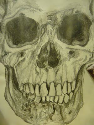 We chose to use this hand drawn skull because we felt that by taking an image of a skull from Google images or taking a photograph of a real skull wouldn’t look as affective. By hand drawing the image meant that we could get the right shades from the skulls texture and we could have the exact view of the skull in which we wanted, in this case it was straight on, so the skull is facing the viewer. I feel it worked well as no one else in the class hand drew their images. This adds originality and makes the DVD cover look quirky. We decided to use this skull throughout our merchandise. This was in order to make the viewer/audience/fans get familiar with the skull in order to link the skull with the band. We used photoshop elements to edit parts of the drawing that looked too sketchy; however we still wanted it to be obvious to the viewer that this skull was hand drawn.
Dvd back cover:
 For this image we grouped the band closely together, either side of the main singer. We felt that the main singers pose needed to play a big role in therefore his stance is with his arms folded and this really stands out and shows his dominance. We kept to the same clothing used for the other photos as well as the performance from our music video as we felt there image should be kept constant throughout. For this image it will be put on the back of the DVD cover underneath the song list, we felt that because we were only going to have a really small image of the band on the front that there needed to be a larger image somewhere else. We will use photoshop skills to remove the background from the image, airbrush it and make it sepia to make it match to the texture and tone of the hand sketched skull.
Dvd album poster:

This is the original image we took for the dvd advertisement, we wanted a close image of the group having ‘fun’, and without making it look odd we put the female band member in the middle of the image slightly lower down with the two males either side. There clothing was all black and white yet I feel in order to follow the style model that the image with be turned to black and white. I will remove the background of this image and place it on top of a black one as well as using Photoshop tools to edit out the thumb as it doesn’t seem to work well as it gives a ‘jokey’ approach. I will turn this all white using the stamp tool so it just looks like his shirt.
Lyrics:

We decided to try something different when it comes to merchandise we decided we would take characters from the music video and use this as a background to the lyrics. We used natural lighting and situated in a forest with the ‘couple’ standing centred in the middle with tree’s either side. The couple are standing either side to one another looking ‘loved’ up by having arms around each other showing a close connection. This will be placed behind lyrics and edited to remove the colour and fit in with other conventions that we have used in the other merchandise.
Sketches
 The DVD disc had no flaws with it what so ever as 100% of people that looked at this image said that the disc looked professional and was original how it is part of the image on the front cover. We took feedback from the other image and changed all the text to white as we want all the text to flow together. The website at the bottom was said to be ‘a nice extra’ to the disc.
Inside DVD:
Dvd advertisement: This is our rough sketch of what our inside of the DVD cover will look like. After asking 20 people what they thought about this design and how they we could improve the design their feedback was taken into account. They suggested that instead of having black text we could change it to white. This is in order for the test to stand out more against the sepia background. We made these changes to the inside of the DVD cover and the rest of our merchandise. Everyone that we asked said they liked the script font that we chose to use for the bands name. 100% of people asked stated that they thought the idea of the DVD being a section of the skull image behind it was an excellent idea. They said it all fits together like a jigsaw. 80% of people that looked at this image said we needed another photograph in the bottom left hand corner of the cover. This is where I have drawn the outline of the picture we used under the dates of the tour. Everyone that looked at this image said that the tour dates is very original and is helpful to the viewer. 10% of people said that their should be the song lyrics on the inside cover behind the DVD on top of the skull, however the other 90% of people said that the skull is more affective by itself. Therefore when we come to making the DVD inside cover we will use the image of the skull by itself.
Poster:
For the poster we did a drafting sketch before making it 5 people from the 20 didn’t like the idea of the image dominant on the poster yet the other 15 thought it was a great idea as it really catches peoples attention in and it’s a good opportunity to portray the band. Other opinions that they give us was to get the emotion of the band members similar, emotions which they said were laughing, happiness and fun. I will try and interpret these when it comes to original photography.
Front of DVD insert flyer:

100% of the people we asked about our rough sketch really linked the idea of taking part of the skulls features and cropping it down, 2 people we asked suggested we used the eyes of the skull but after trying this in the making it didn’t seem to work as well as the teeth. Therefore we decided to use the original idea saying as a majority of people were actually in favour of us going with the teeth idea.
Back of DVD insert flyer:
 17 out of 20 thought it was an effective idea to use the same image on the front as the back because when it is turned about they see the same thing which makes the reader think about it and therefore makes them likely to read the information that is on it. 100% liked the idea of having the bands name across the top again reminding the reader of the bands name and style.

This is a sketch of what our DVD cover will look like, front, back and spine. We asked 20 media students to look at this design and tell us possible things we could improve on, and also what they like about this design. 70% of people said that their needs to be another image on the front cover, such as a band shot. I have outlined a where we will place a photo in the left eye of the skull. When I then suggested this as an idea to the 70% of people that suggested it needed another image they all agreed that this was a quirky and original way of adding in an extra photo.
On this sketch there is only 19 songs, as my style model had 21 and the song listings are written in two colomns 19/20 people said I should round it up to 20 songs on the DVD. I also agreed with this and when we come to make our DVD cover we will include an extra song. This will make it look more neat and tidy.
Where there is a blank box, this is where we will write copyright information. 20/20 people we asked said that this will make our music DVD cover look more professional as this copyright information appears on many DVD's. I will make the information relevant to our DVD and I will also make it in a small font as I do not want to draw the readers attention away from the DVD cover itself.
Wednesday, 18 November 2009
Mood board
 I was assigned the role of helping creating merchandise to promote the bands album therefore before I started this I collected a range of images including band shots, logo’s, existing album covers/posters ect to influence and inspire me before beginning the making of the products to promote our band. I feel by creating a mood board it has give me some initial idea’s of typical conventions that I may interpret into promoting the band.
Monday, 28 September 2009


Thursday, 24 September 2009
Music Video Theory
About the theorist
Andrew Goodwin suggested that music videos have to have certain key features or at least a majority of them in order to be recognisable and successful. He has identified a number of key features in music videos. The key features that he believes is that there is a relationship between the lyrics and the visuals, and a relationship between the music and the visuals. This relationship is shown through visual illustrating, amplifying or by contradicting the lyrics or music. Another key feature is close-ups of the main artist or vocalist. He also believes that the practice of obtaining sexual gratification by look at a sexual objects or acts play a part in music videos; this term is often referred to as Voyeurism. The final key feature is that intertextual references arise to other media products present. He says that music videos are often constructed by the link between the visuals and the song plus the artist. Relationships are built between these in the video, and the close-ups of the artists gives them the representation and publicity they require. Voyeurism is used to increase the video’s attractiveness, particularly to males, whilst intertextuality is often employed in humorous videos.
My opinion
I think music and visuals have a strong link anyways therefore should relate to one another, I also agree that lots of close ups should be used as this helps portray the artists image and publicise them as an artist rather than just another music video out on the market. I think voyeurism is particularly shown in R & B music and they rely heavily on the appearance of a women’s body to make their music video attractive especially to attract the male audience. Goodwin also states that music videos demonstrate certain characteristics linked with the genre of the music, girl groups would usually include a dance routine example The Saturdays ‘I just cant get enough’ and Girls aloud ‘Biology’. Or say if it was a rock band they also tend to have a staged performance element to it. I strongly think that there should be a relationship between lyrics/music and visuals as this gives connection and helps portray the storyline or narrative.
Analysis of Chosen video
http://www.youtube.com/watch?v=Lm7XVOeXf2U
Taking back sunday - You're so last summer
I have decided to analysis a music video by the band that I have chosen to make my music video to. Within the first few seconds Goodwin’s theory appears present about certain genres having certain characteristics. Goodwin says that most rock bands have a performance element and this video is no different the video is based on the band performing to the camera. Close-ups of the main singer are present once again proving Goodwin’s theory correct, This close up gives a close view of what they are wearing portraying them in a clear light it also gives a personal approach that the viewer can have with the performer. This music vido is particularly interesting as it is of two artists that have came together to produce a song, Taking band Sunday are a traditional rock band whereas the rap artist that is featured in the video conveys convention that are traditional for rap artists, the close up shots really help portray these singularly as taking band Sundays outfits are very dull and their make is very black with eyeliner where as ’Flavor flav’ is wearing baggy clothing, with a gold chain around his neck showing the music genre he is normally associated with. The main body of the video portrays the band performing the song on stage, while Flavor Flav and Adam Lazzara (Taking band Sundays main singer) alternatively sing the lyrics. The video concludes with a shot showing the band members standing in the street on which the music video opened, and, one by one, disappearing, until Lazzara alone remains. When ‘Flavor Flav’ and ‘Adam Lazzara’ are singing this is mainly when the close-ups are being used. Even though this is a all male group no dance routines are present yet I don’t think this would be appropriate for rock music due to the heavy baseline and upbeat rhythm. I don’t think the lyrics really correspond with the visuals as there isn’t really a storyline played amongst this it is mainly performance based however through what we can see we pick up emotions that they may be feeling.
Applying Goodwin's theory to our music video:
Andrew Goodwin's theory applies to our music video that we are to make. This is because, as the band that we have chosen to use (Taking Back Sunday) has a genre of rock, we have decided to include a performance within our footage. We are also going to assure that our visuals have a relationship with the lyrics of the song, these will be illustrating what is being said in the story behind the lyrics, this will make it easier to the viewer to understand the song and know what it is about. We have analyzed the lyrics to the song we have chosen (Cute Without The E) and have several original ideas. Another way in which our music video will support Goodwin's theory is having close-ups of the two main singers, as this is what all music videos include it is vital that we have several of these included within our video. We will also have close ups of objects such as the drum sticks/drum kit when it is being played and the guitars. We have discussed many close ups which will add a professional tough to our video.
Wednesday, 23 September 2009
Initial group Ideas
After deciding on the band and the song we researched the artist, finding out their target group, this is teenagers from 15-20 and the genre of music is 'rock' however the band is quite 'emo'. As we are wanting our music video to be successful we made a questionnaire targeting the same age group and asked them 10 questions about music videos in order to widen our knowledge of what rock fans would expect to see within a music video.
Costume and mise en scene is very important within our music video as this was stated by our target group. The boys in the group are going to wear black suits with white shirts, and the girls are going to wear big black eyelashes, dark makeup, black tutu's and ripped tights and ripped black tops, this is to make them look mysterious and scary in order to fit the genre of music.
As our target group specified in the questionnaire, it is important to have some performance footage within the music video. As 32/80 stated this was important we are going to include us as the band playing instruments on the school stage with an audience. The camera will be panned around the room showing the crowd go crazy for the band. This would make it seam like it is a real gig. We are going to film most of our video outside as we can achieve natural darkness, this would also fit in with the genre of music.


List of Roles
 Laura
Laura Sophie
 Connor
 James
James


